The Dashboard
The Dashboard provides you with a configurable view of your content, allowing you to quickly focus on the content items and editions that you need to work with. Your dashboard opens when you log in to the Dynamic Content app and you can also view it at any time by clicking "Dashboard" in the masthead at the top of the window.
Once you've configured the dashboard the way that you want it, your settings are saved and will be restored the next time you login. Once you set up the dashboard the way you want, you don't need to change the settings again.
If search is enabled on your hub, then the dashboard will show the Search dashboard tab. The dashboard can be extended to include additional tabs, for example, a Google analytics tab. For more information, see the Example extensions page.
Content dashboardLink copied!
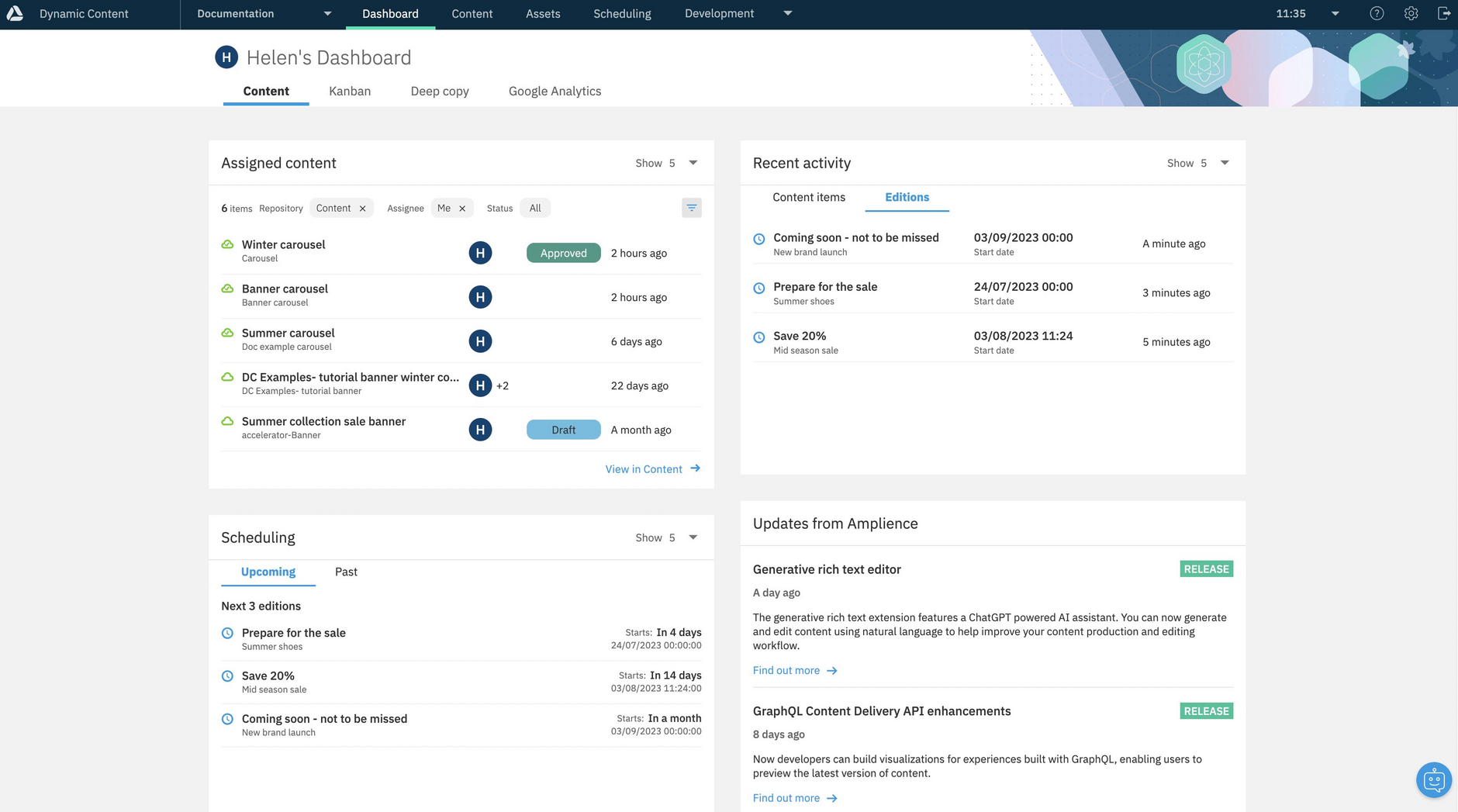
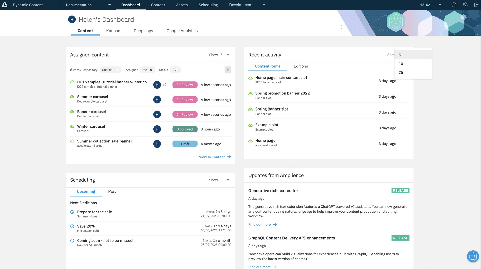
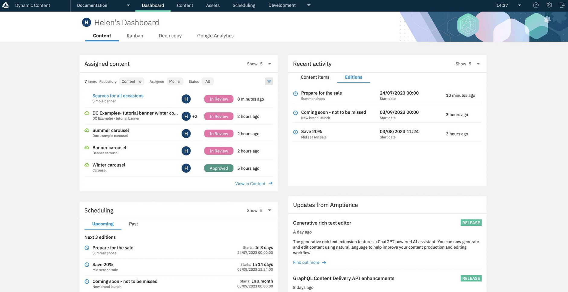
The Content dashboard consists of five widgets: Assigned content, Recent activity, Scheduling, Updates from Amplience and Content report.
By default the assigned content widget displays the 5 most recently updated content items across all the repositories in your hub, but you can customize it to suit the way you work.
The recent activity widget shows your most recently viewed content items and editions.
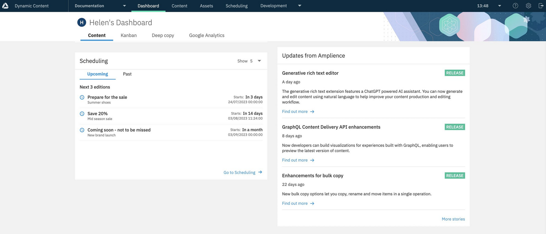
The scheduling widget shows your upcoming and past editions, so you can see at a glance the next editions that are scheduled to go live and those that have recently been published.
The updates from Amplience widget is updated regularly with news about new features and links to documentation, blog posts and other useful information.
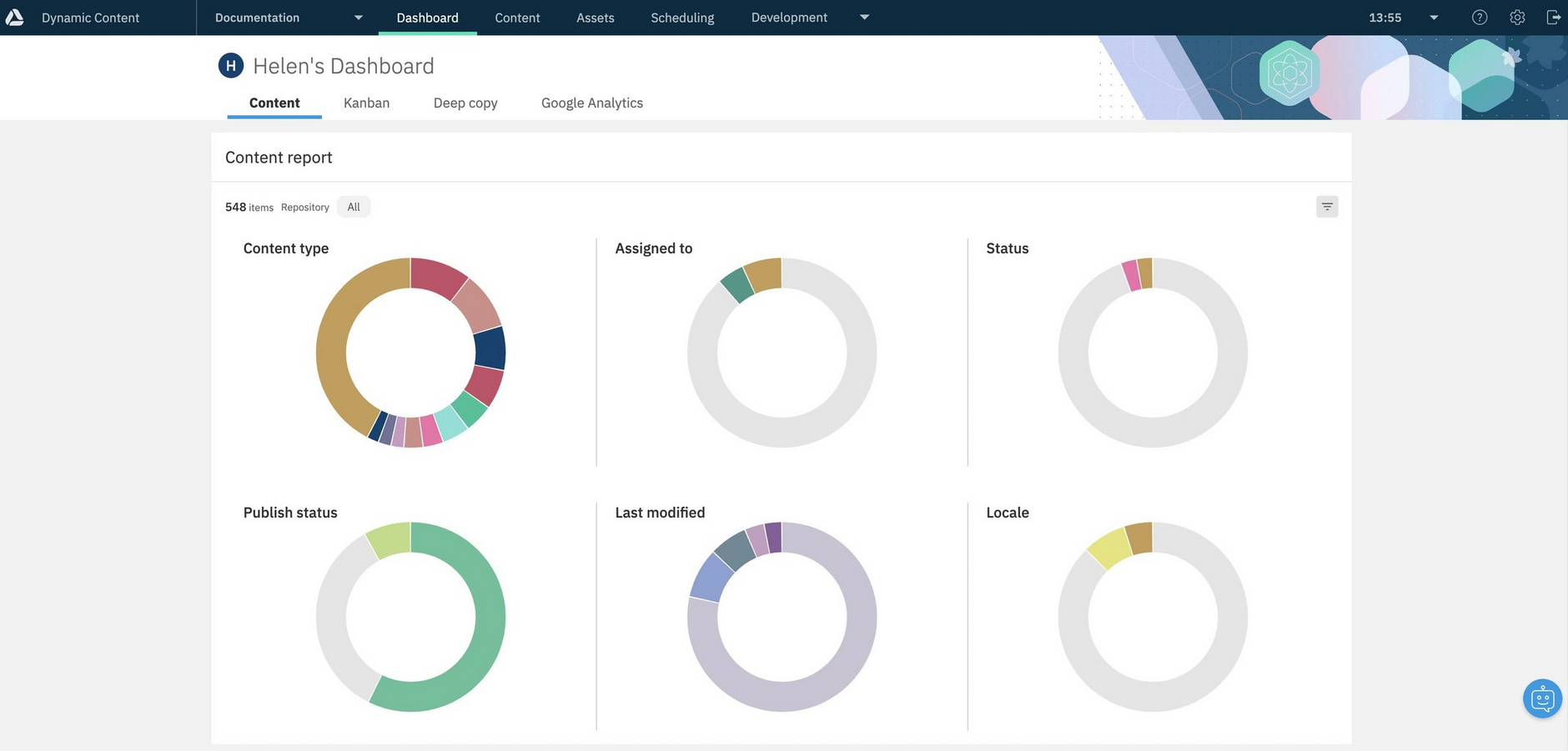
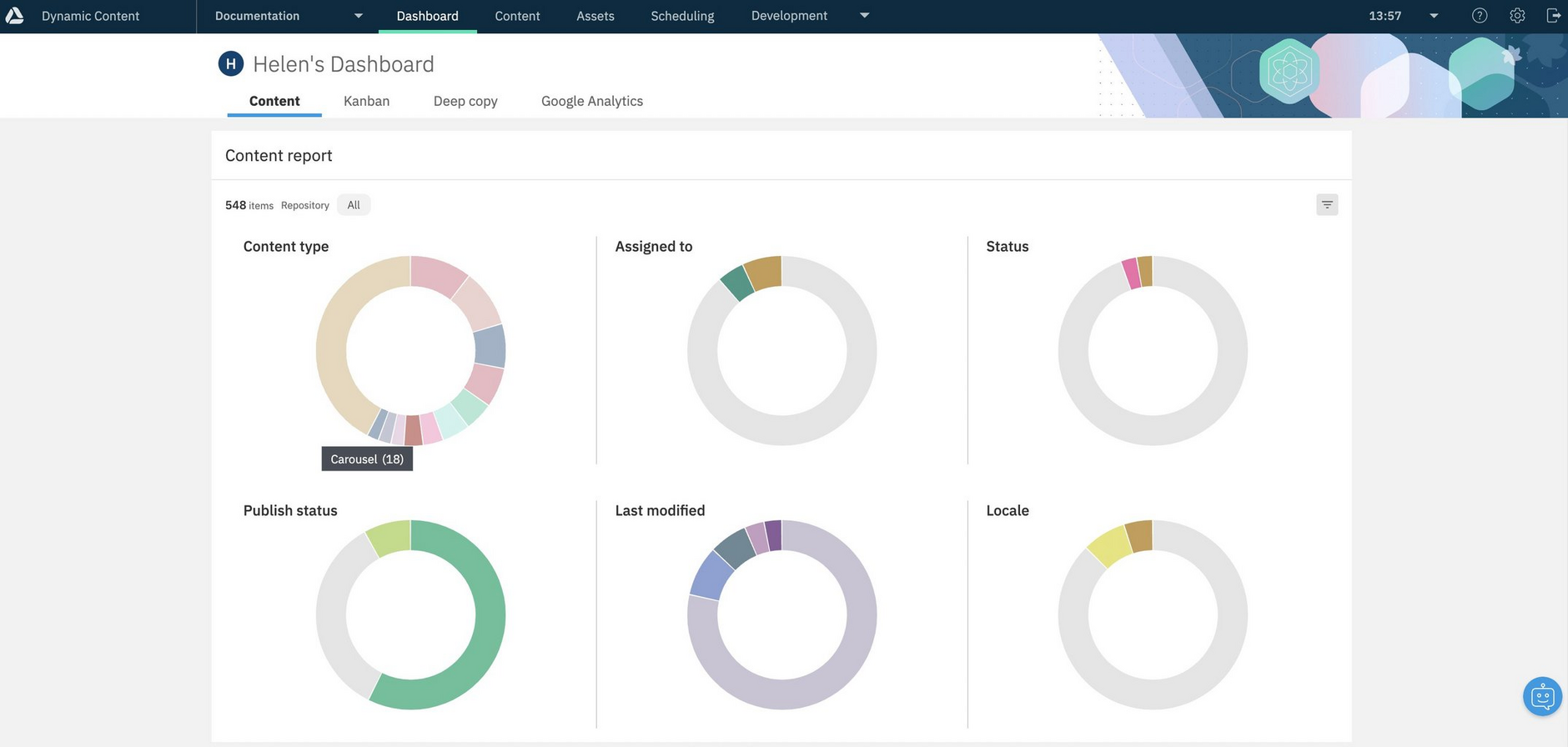
The content report provides a visual summary of different aspects of your content. It displays a summary of your content by content type, assignee, status and locale. It also includes a breakdown of content by publish status and modification date.
Configuring the number of items displayedLink copied!
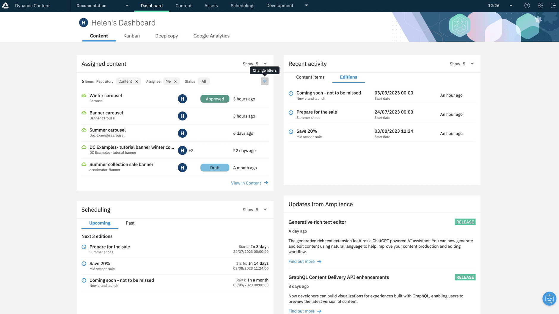
The assigned content, recent activity and scheduling widgets all allow you to configure the widget to display either 5, 10 or 25 items. To choose how many items to display, select the menu at the top right of the view, as shown below.
Assigned content widgetLink copied!
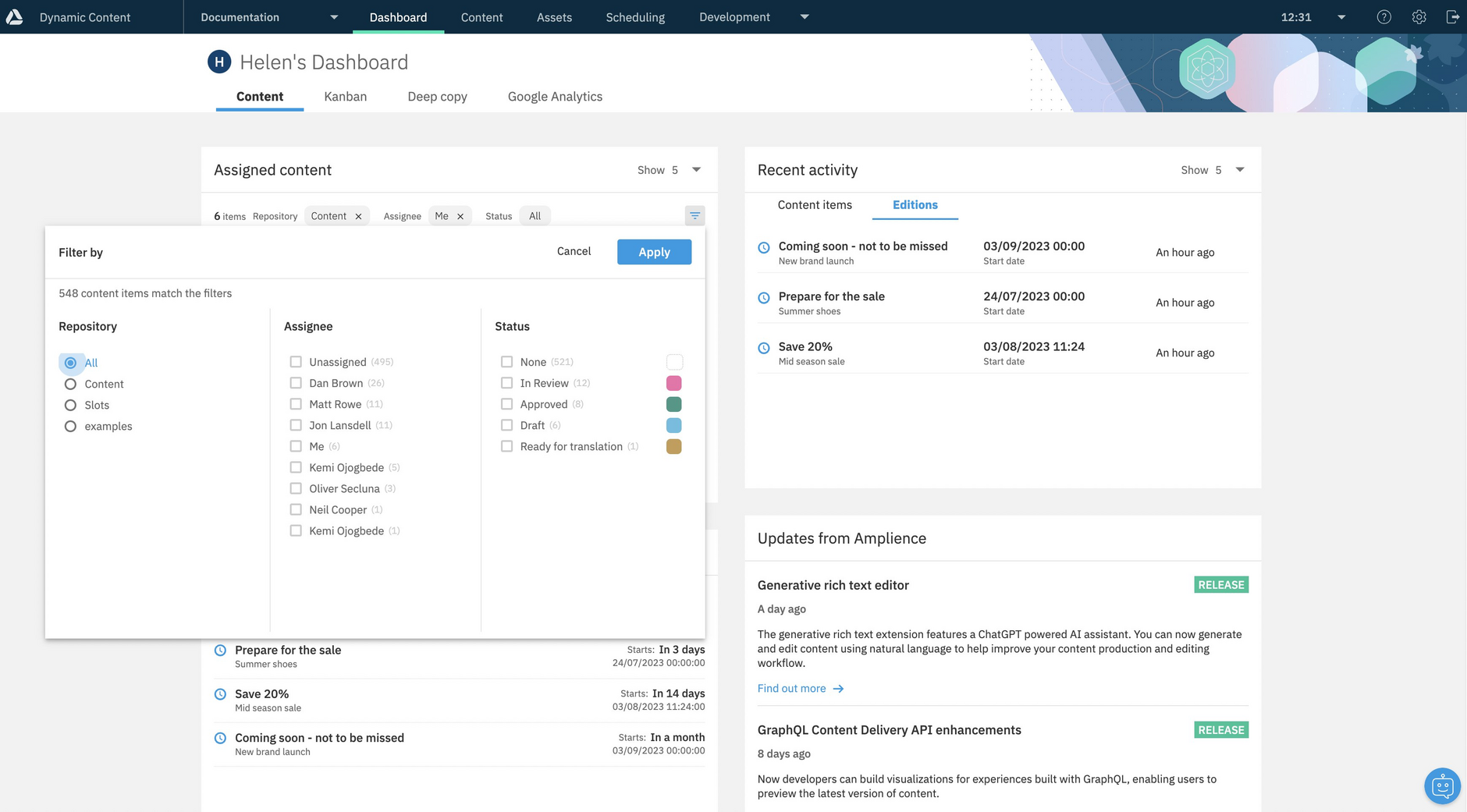
To customize the assigned content widget, click the filter icon (1 in the image below).
The assigned content widget can be configured to display content assigned to you, or one or more other users, items with a chosen status or within a specified repository. So, for example, if you are working on French localized content, you could focus on content assigned to you, with a status of "ready for translation" and stored within the "French-Website" repository.
When you've chosen your filters, click the "Apply" button. The Assigned content widget will be updated to reflect the settings you chose.
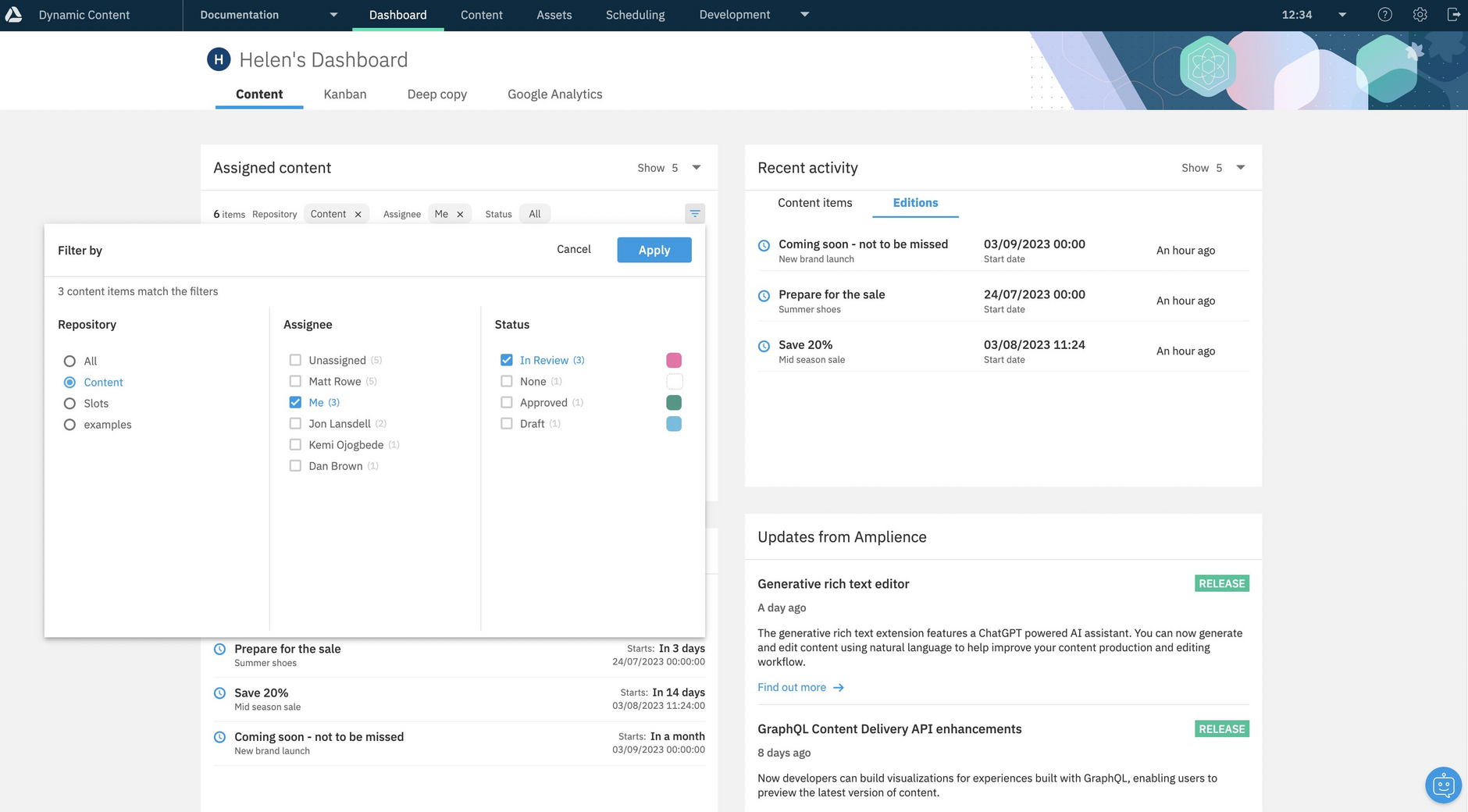
To show content "assigned to me" and with a status of "in review" you'd set up the filters as shown below.
Click "Apply" to close the window and apply the filters.
Clicking the content item title will open the item's content form.
Recent activity widgetLink copied!
The recent activity widget shows your most recently viewed content items or editions. This widget is tied to the current user, so it will display the most recent items you've been working on rather than those viewed by other users.
When you choose the Content items tab (1 in the image below), the 5 most recently viewed content items, in all repositories on your hub, will be displayed. You can configure the widget to show 5, 10 or 25 items by using the menu on the right hand side of the window.
Clicking the content item title will open the item's content form.
To display your most recently viewed editions, click the Editions tab. You can choose to display the 5, 10 or 25 editions that you most recently viewed.
Click the edition name to make changes from the edition details window.
Scheduling widgetLink copied!
The scheduling widget lets you see the next editions that are scheduled to go live. As with the other widgets you can choose to display 5, 10 or 25 editions.
The icon to the left of the edition shows its status, so you can quickly tell if an edition start date is imminent, but the edition has not been scheduled, or if an edition has been scheduled that you no longer want to go live.
As with the recent activity widget, you can click the edition title to open the edition details window.
Viewing past editionsLink copied!
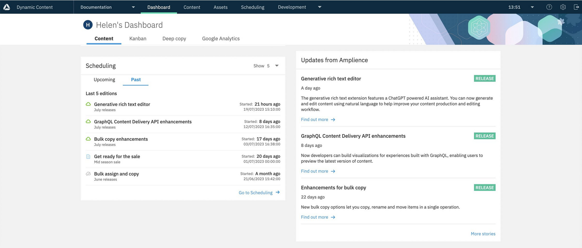
If you click the Past tab, the widget will display the most recent editions- these are the editions whose start date has been reached. The list is ordered by start date, with the most recent first and will show both published editions and those still in a draft state.
Updates from Amplience widgetLink copied!
The updates from Amplience widget is where we display the most recent product updates and links to documentation, blog posts, videos and other information.
Click "more stories" to view older stories.
Content report widgetLink copied!
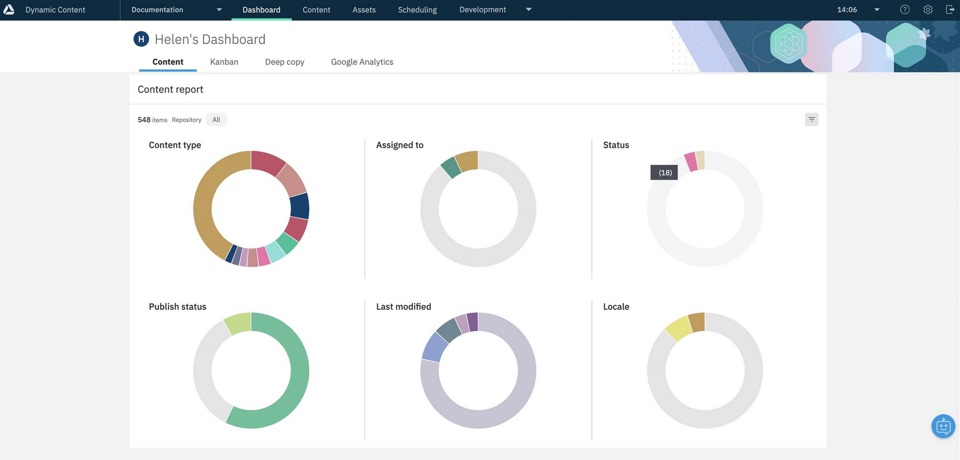
The Content report is shown at the bottom of the Dashboard and is divided into sections with charts presenting a summary of content by content type, assignee, status, publish status, date modified and locale. If there's nothing to show in any section, for example if you don't have any content items with locales, then the section will still be shown but the chart will be empty (and shown in light gray).
The Content type section shows the content types used most often to create content, each represented by different colors. Hover over a color to see which content type it represents and the number of items created from it. All other content types are grouped together in the other category.
The assignee and locale sections are organized in the same way, with the most frequently used assignees and locales shown with different colors and everything else shown in the other category.
In the statuses section, the colors of the chart match those you assigned to each status. In the example below, the most common status is "in Review".
Publish status shows those items which have been published, published with an earlier version or not published.
Date modified uses the standard filters provided in the Content Library, so you can see how much of your content was modified within the last 7, 14, 30 or 60 days, as well as content that was last modified more than 60 days ago.
Filtering the Content report by repositoryLink copied!
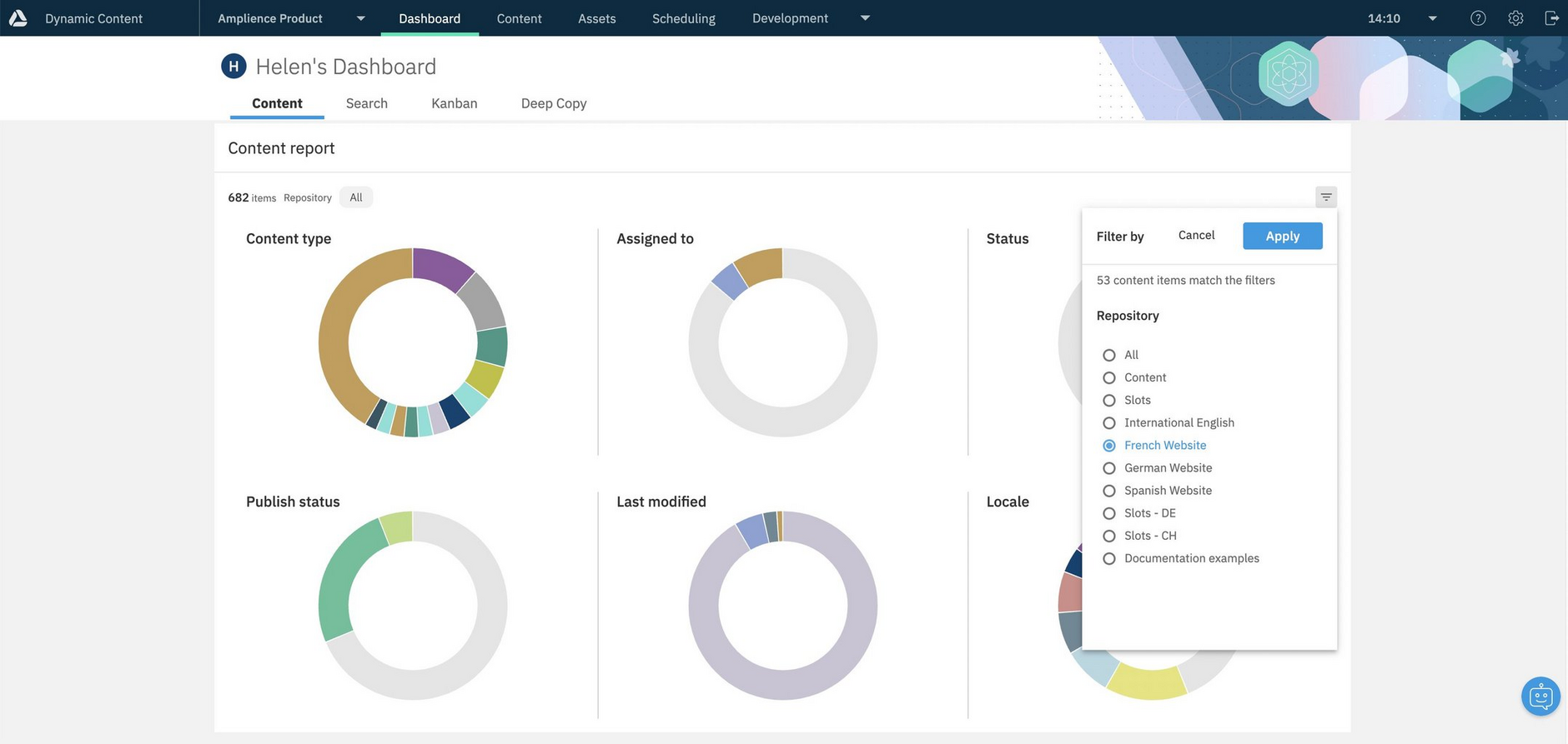
By default the Content report will display information about content in all your repositories, but you can choose to focus on a particular repository. This is particularly useful if you use different repositories for different teams, for individual brands or language specific content, for example.
To filter by repository, choose the filter icon on the top right of the window. Then choose the repository to focus on and click "Apply".
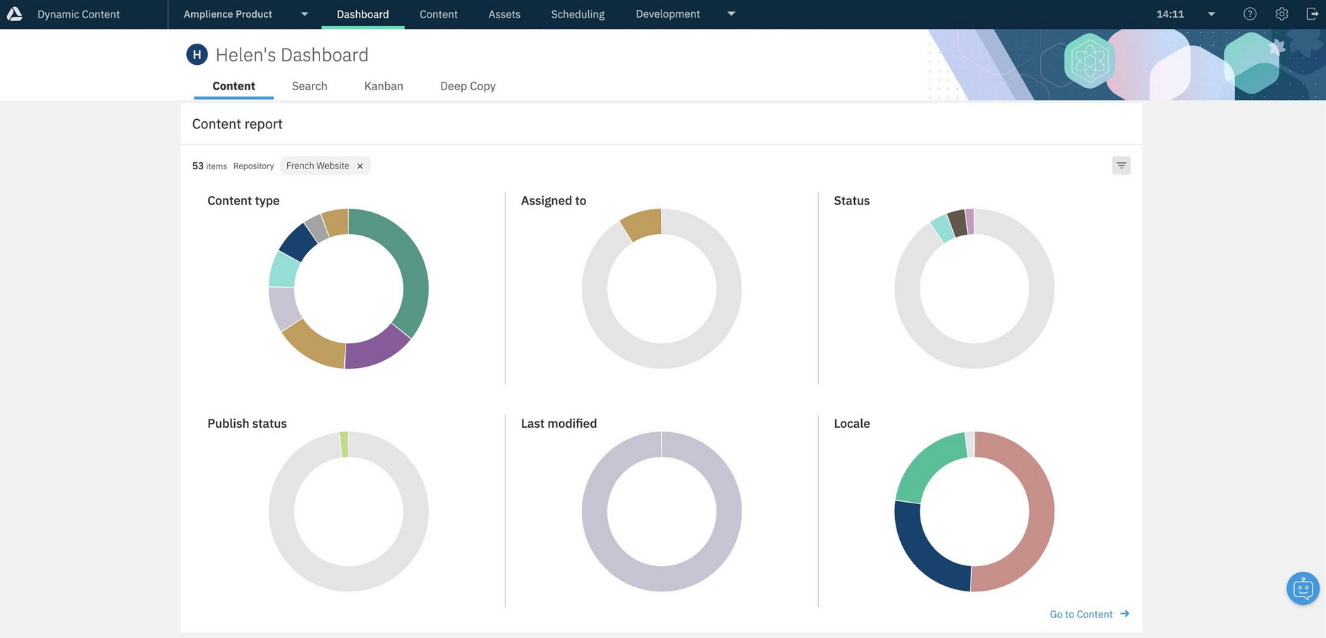
The Content report will be displayed with each chart showing information about content in the repository you chose. In the example below we're showing the Content report for the French website repository.
Opening a content item from the dashboardLink copied!
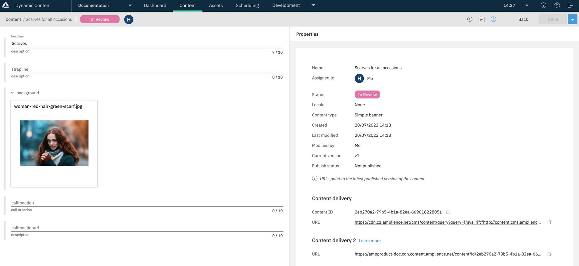
In the assigned content and activity widgets you can open the content form for a content item by clicking its title, as shown with the "Scarves for all occasions" content item in the example below.
The content form is opened for the "Scarves for all occasions" content item.
Opening an edition from the dashboardLink copied!
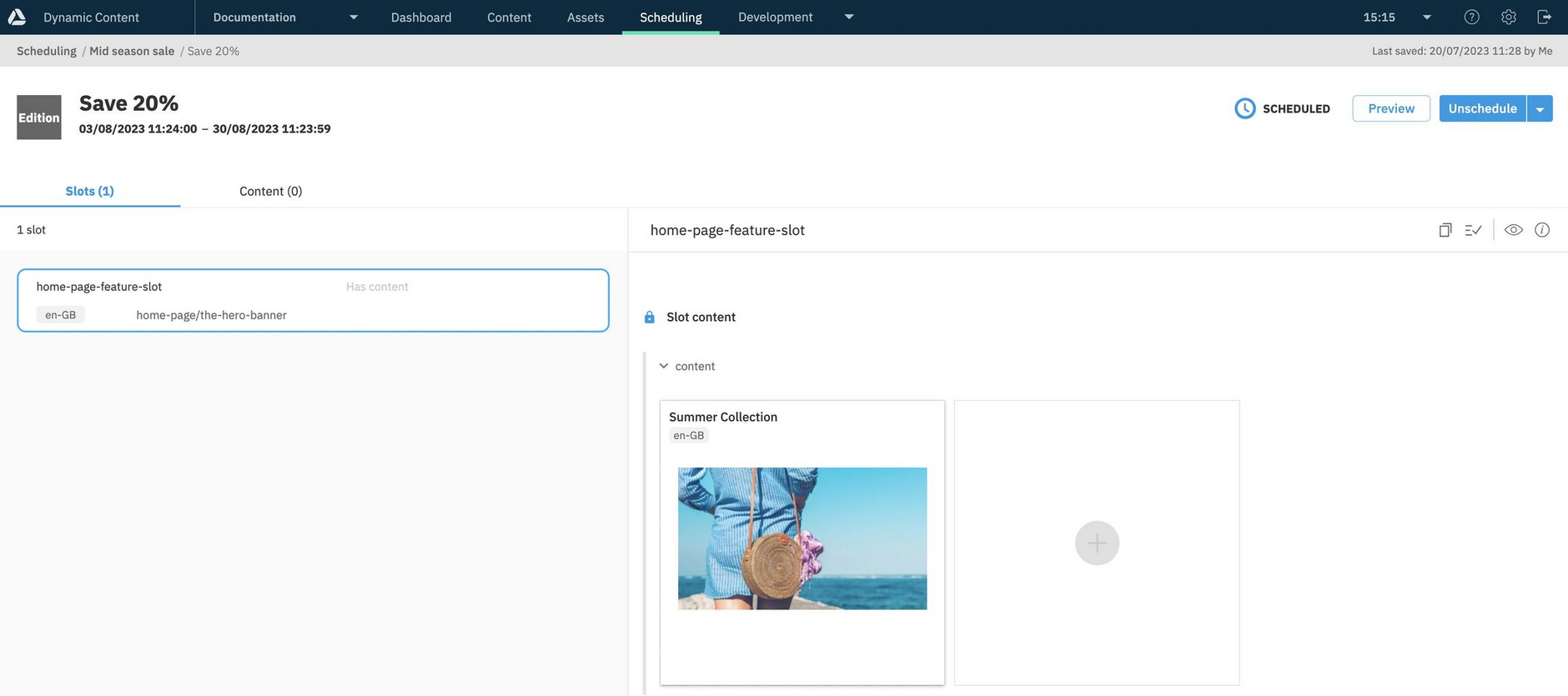
When viewing editions in the activity and scheduling widgets, if you need to make any changes to an edition, click its title to open the edition details window.
You can then edit the edition to make changes.
AI Playground dashboardLink copied!
The AI Playground dashboard is available from the Dynamic Content dashboard, for users to try our AI services. The playground is ready to use and requires no set up, making it easy for users to explore the AI services and see how they can speed up content creation.
Each time you make use of one of our AI services from the playground, for example, to generate some text or an image description, you will be spending one Amplience credit.
To use the AI Playground, open the Dynamic Content Dashboard, then choose "AI Playground".
The AI services shown in the playground fall into 3 categories:
- Try it now - AI services that are set up in the playground ready for you to use
- Learn more about - AI services that are available to use, but not yet included in the playground
- Coming soon - AI services planned for release
To try an AI service, select it from the Home page, or the left menu, then follow the on-screen instructions. Here, the Image Alt Text Generator has been selected.
Any content you create in the AI Playground will not save to your Amplience account.
For specific information about the individual services and how to use them, see AI services.
Search dashboardLink copied!
The Search dashboard is available to users of Dynamic Content Search and displays search analytics information to allow you to monitor and improve the effectiveness of your search functionality.
The search analytic information provided on the dashboard allows you to determine how well search is working on your website, app or any other channel, and includes the most popular search terms, conversion rates and which terms users were searching for that returned no results.
On this page we'll provide you with an overview of using the search dashboard. While the basic analytics tracking works out-of-the-box, click tracking and conversion rates will require developers to add some tracking code. You can find more information on the Dynamic Content Search overview page.
Using the search dashboardLink copied!
When you have Dynamic Content Search enabled on a hub, two tabs will be shown at the top of your dashboard: "content" and "search". The "content" tab is where you'll find widgets showing usage of your content items and editions. You can find out more about these widgets on the dashboard page.
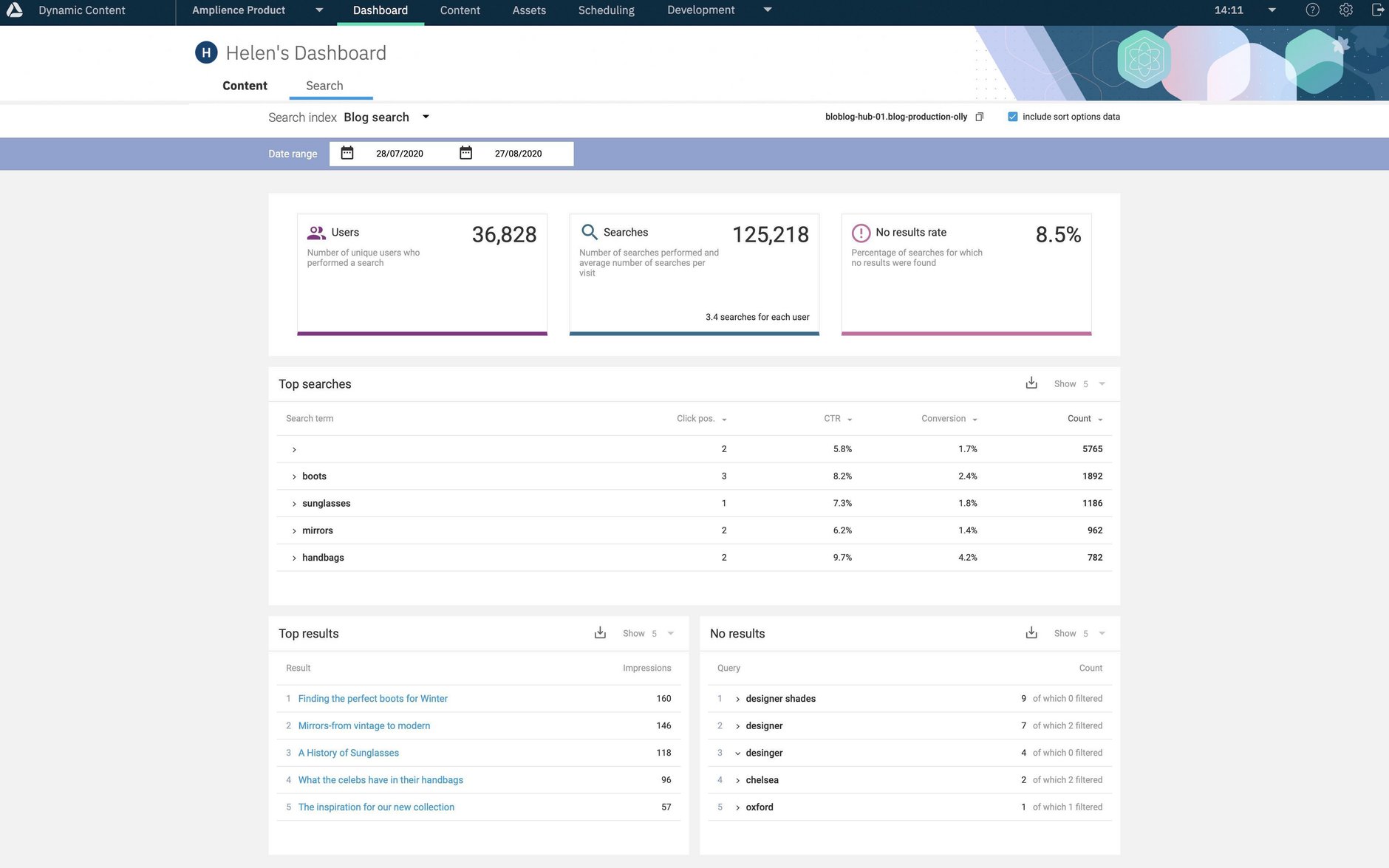
Under the search tab you'll find the search analytics widgets: overview, top searches, top results and no results. We'll provide an overview of the information displayed in each of these widgets.
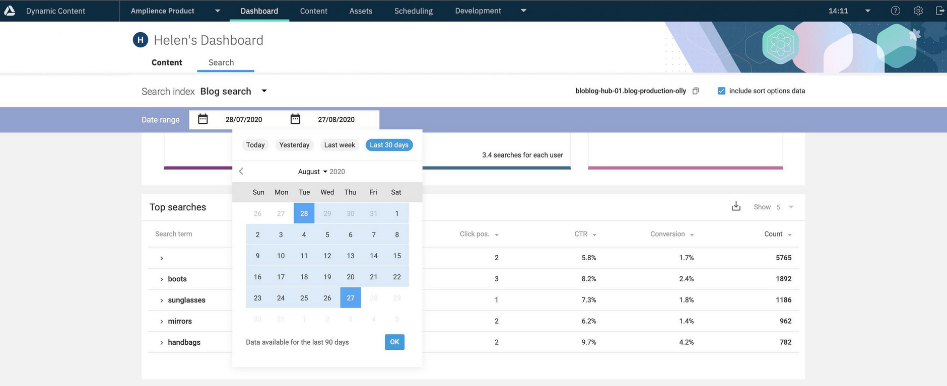
When the search dashboard opens it will show the last modified index. You can choose another index from the search index menu (1 in the image below). The menu will contain the label for each of your search indexes, so it's important that developers set a label that makes sense for users.
Note that analytics will only be shown for production indexes. Production indexes contain published content whereas staging indexes contain unpublished content and will not have analytics data. Indexes are configured as production or staging when they are setup.
When you have chosen the index the index name will be shown together with a copy button. The index name is useful if you need to ask a developer to update any index settings, as it will help them find the index in Development > Search Indexes.
The "include sort options data" checkbox allows you to choose whether to include data for each of your sort options. This is enabled by default. More information about sort options can be found on the sorting page.
Choosing a date rangeLink copied!
To choose the date range for the analytics data you must pick a start date and an end date in the date picker. Click on the current date range to open the date picker and click a day in the calendar to choose the start date, then click on another day to choose the end date and finally click OK. We've included a few shortcuts to show today, yesterday, last week or the last 30 days.
If you choose to display data for today, then it not be a full 24 hours worth of data. The start time is 00:00:00am, UTC on the start date and end time is always 23:59:59pm, UTC on the end date.
Search analytics appear on the dashboard approximately 10 minutes after the search operations occur.
Search analytics overview widgetLink copied!
The first widget displays some key performance indicators to help you understand search user behaviour for the selected index in the selected time period.
It shows:
- Number of users. This is the number of unique users who use search for this index.
Note, that if your index shows an unexpectedly low number of users, your developers may need to configure the analytics to identify unique users. See the analytics section of the search overview page for more details.
Searches. This is the total number of searches performed during the selected time period. The average number of searches per user is also shown.
No results rate. This is the percentage of searches that returned zero results. If this is a significant percentage of your searches then this helps you identify a poor user experience.
The example used on this page is a blog on a website that tracks clicks on each blog and is configured to measure product conversion from within the blog content.
Top searches widgetLink copied!
In the top searches widget you'll find information about the most common search terms during the selected time period.
You can choose to display the top 5, 10 or 25 search terms or download the entire list of search terms as a CSV file (up to 1000 are stored).
By default search terms are sorted by count (descending), so the most popular search terms are displayed at the top. You can change the sort order or choose to sort by conversion rate, click through rate or click position. When you change sort order different data will be shown, for example if you sort by count (ascending) you will now be displaying the least popular searches.
An expand icon is shown for each search in the list. Expanding a search term will show the top results for that term. For the blog example it will show which blogs were returned, for a product search it would list the product pages. Up to 100 results are shown and you can download up to 1000 top results in a CSV file.
The first item shown in the top searches will usually be an empty search term. This indicates that there is no user entered query and that a search was performed to generate default results.
For each term the following information is shown:
- Click position. This is the average position of each result for that query. The lower the number the better, since this implies that the user didn't have to scroll too much to find the result they wanted.
- CTR (Click through rate). This is the percentage of people who actually clicked on a result following a search. In the case of the blog example, it's the number of people who clicked on a blog in the search results.
- Conversion rate. Developers will need to set up code to track the conversion rate in their code. In a blog it might refer to the percentage of times a user clicked on a product details page from a blog, or when doing a product listings search it could be linked to an "add to basket" button.
Top results widgetLink copied!
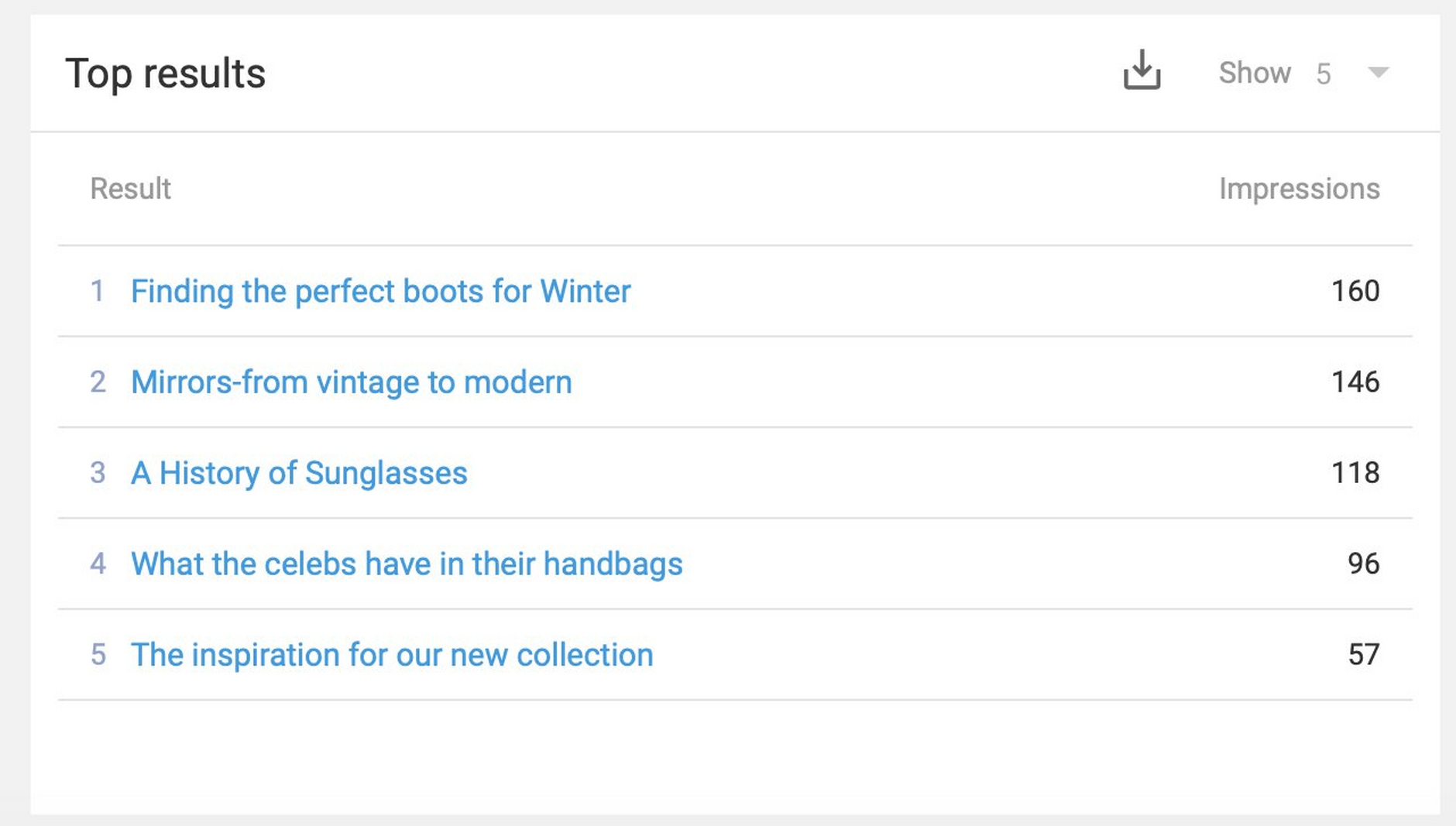
The top results widget displays the top 5, 10 or 25 results across all searches. These are the most commonly returned results, rather than the most clicked on. The impressions indicate how often each result is shown in a results page view.
The results are a list of content items, of the content type that your search index is configured with. In our blog example, each item is a blog content item and clicking the item title will open the content item in the content library.
No Results WidgetLink copied!
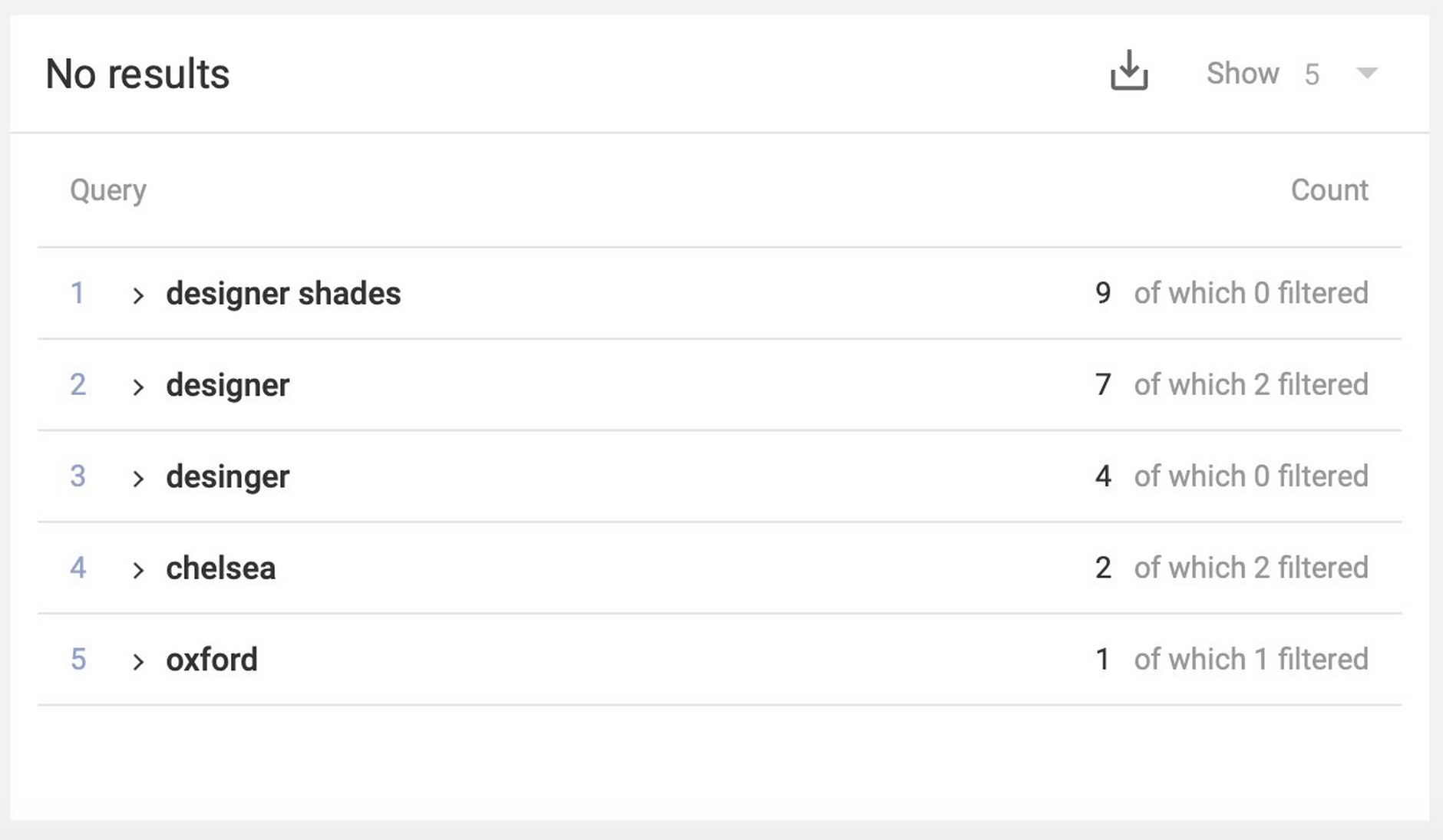
The no results widget shows the most common search queries that returned zero results. These might be misspelled terms or just terms for which no related content can be found. You can choose to display 5, 10 or 25 items in the list or download the entire list as a CSV file.
The number of times each search query was used is displayed, together with a count of filtered searches. This indicates a search that was performed with a facet selected.
When you expand a no results entry, any facets that users selected when performing a search will be displayed. In the example below, no results were found on 2 searches when the user selected the sunglasses category. The other searches for "designer" returned no results with no facets selected.
The no results widget is useful for content managers who can plan new content for commonly used search terms that currently return no results, or add facet values to existing content.
